The Heart Group – Putting Patients First


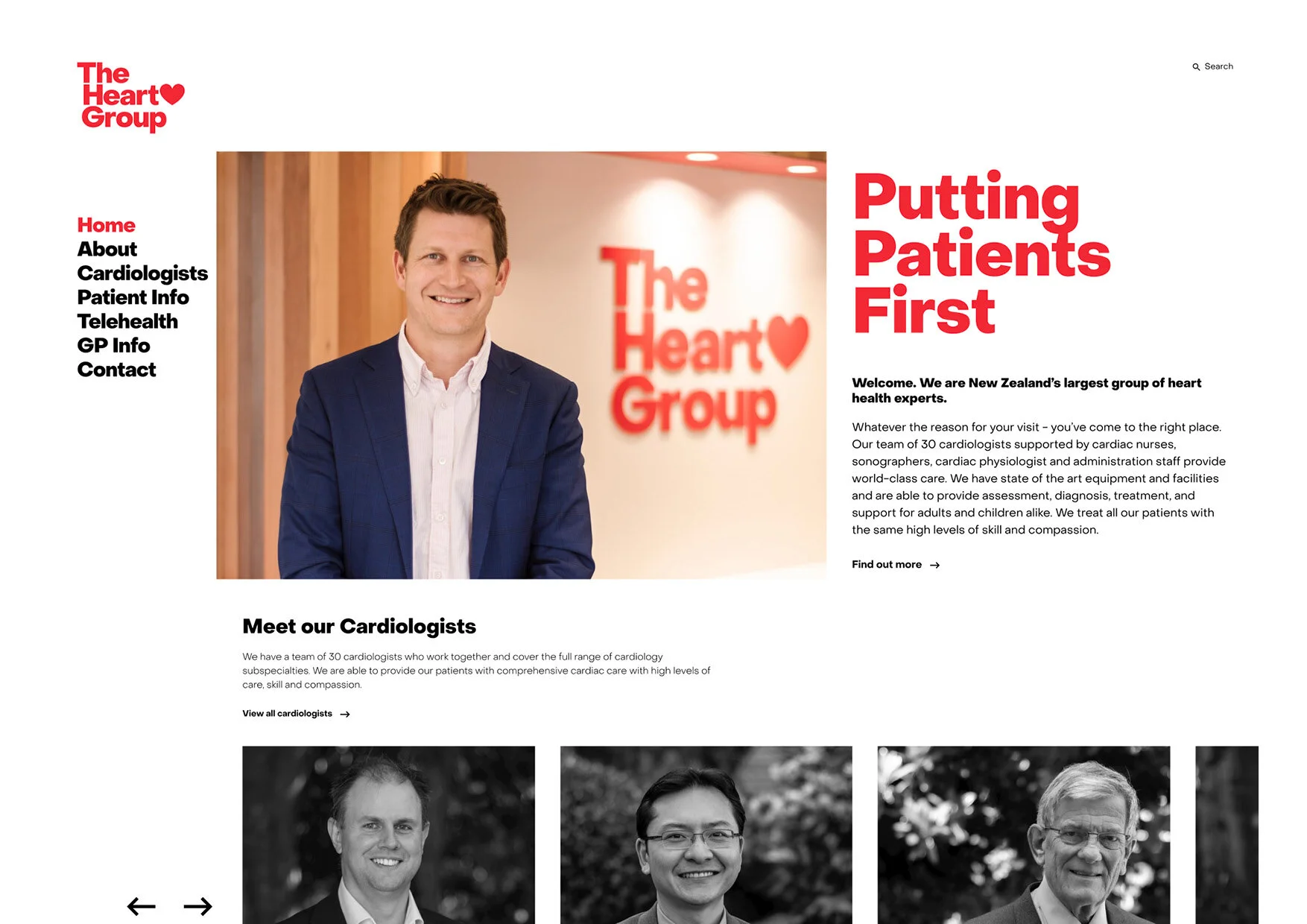


Ready to break free of the cold and clinical reputation of medical institutions, The Heart Group approached us looking for a brand refresh. We centered this around 'the heart within'. The refresh celebrates the important work the organisation does, but also emphasises its deeply human nature. The rebrand prioritises bright, warm reds, adding an emotive, playful element. Using the iconic heart shape, we transform scary, unfamiliar clinical territory into something well-known and accessible. The heart is positioned in the middle of our shortened logo, and sometimes replaces the word itself. Just as The Heart Group puts their patients first, we made sure this was a human-led refresh.